From DragonRouge website: "Challenge: The idea was to create new growth drivers for Yoplait by helping it penetrate
a new segment without taking it away from the core Yop consumer base: young adults who like soft drinks.
Dragon Rouge identified three key priorities:
-Be straightforward and honest, avoiding caricatures of the codes appealing to young people
-Express the unique sensorial experience afforded by a product that is sweet and bubbly
-Mark a breakthrough in a crowded dairy drinks segment
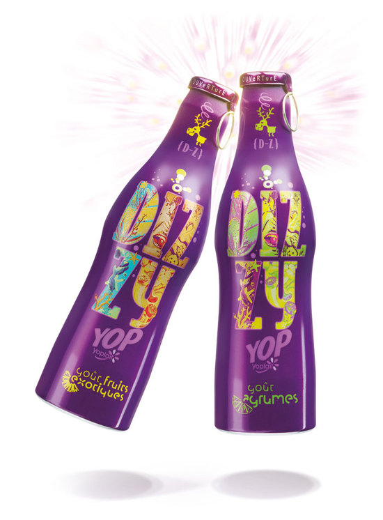
Solution: Dragon Rouge portrayed Dizzy as delivering unique sensations to “free the mind and stimulate the senses”, taking a disruptive view of the dairy universe:
- Aluminum bottle
- Powerful color code that is both premium and innovative: purple
- Background that evokes a polysensorial experience
- Mascot: an “utterly deranged” moose
Sold on dairy drinks shelves since September 2008, Dizzy has proven highly popular with teenagers. The comprehensive visual universe created for the new brand allows it to be expressed via numerous applications: the brand can “speak” and the moose can “speak for it”. The associated color, typography and photographic registers
are immediately recognizable."
Reference:
http://www.dragonrouge-usa.com/files/casestudy/63/pdf/dr_dizzy_en.pdf
