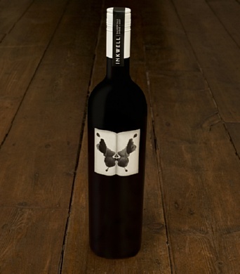
Inkwell approached Mash to rejuvenate their wine packaging and brand identity. The ink splatter forms the central part of the brand identity and packaging. Logo type was kept simple and used on a neck label to keep separation between
the type and the strong yet simply presented ink imagery. The label shape reflects the open pages that would create such a pattern. Uncoated stock was used with 2 levels of high build gloss varnish on the ink area, giving the label a three
dimensional feel.
Reference:
http://www.mashdesign.com.au/projects_html/inkwell.html


