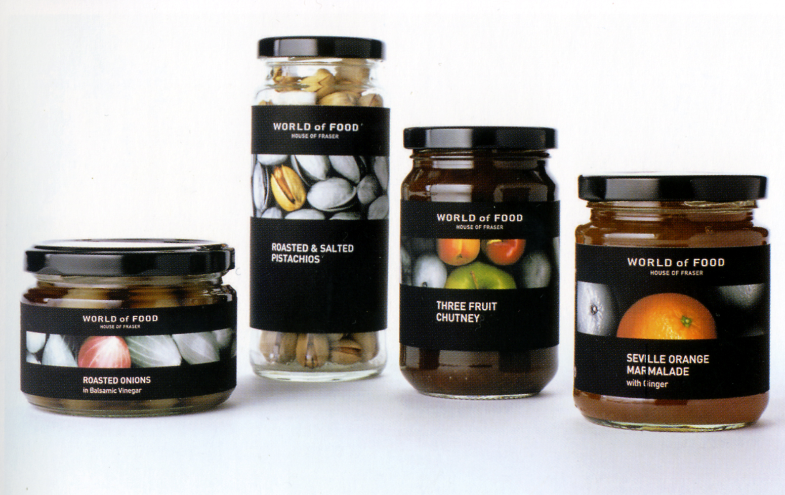
Department store House of Fraser has successfully embraced the trend toward "masstique" - products that are mass designed, but with an aesthetic edge that feels luxurious. With its World of Food concept, it targets adults interested in the premium delicatessen market, offering them products at a more accessible price point, with a more relaxed attitude. The packaging concept was developed to work across 300 SKUs (stock keeping units) and a variety of food products ranging from wine and champagne to chocolates, cookies, smoked salmon, pasta and canned foods. For ease of impplementation, the mark had to work clearly in black and white. The brand reflects a modern approach to food and cooking using design cues that are immediately recognizable as premium, softened with a warmth and approachability that speaks to the House of Fraser consumer. The World of Food sub-brand uses a modern, simple, uniquely drawn font style with the word "food" highlighted to communicate the offering with clarity and confidence.
Reference:
Mark Hampshire, Keith Stephenson, DemoGraphics Packaging, Logos, Modena, 2007


