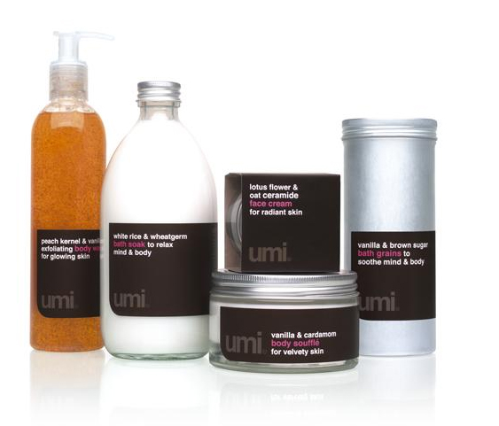
Waitrose Fusion products are part of a trend that appeals to this consumer. The Umi range, designed by Pearlfisher for high-end supermarket Waitrose, uses elements of premium food packaging to create a "gourmet toiletries" theme, helping to transfer the store's food expertise to its non-food ranges. Japanese for "beauty" the name Umi evokes a sophisticated marraige of beauty and food for the skin. The minimal design uses simple shapes and finishes. The premium black labels feature tempting names like "body soufflé" in punchy hot pink typography with exotic ingredients lists that convey a sense of luxury, provenance and perfection.
Reference:
Mark Hampshire, Keith Stephenson, DemoGraphics Packaging, Logos, Modena, 2007; Arts Project N.109 Packaging Design, April 2008
