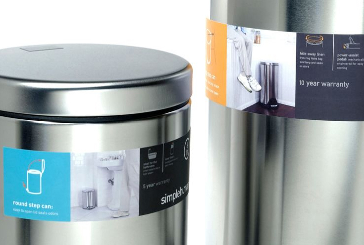
Understanding the target consumer, Smart Design determined the simplehuman brand strategy: to shift the focous from product to lifestyle -how you live your life and how the quality of your life is improved with these products. A dynamic packaging system conveys a consistent message by emphasizing benefits, rather than features, using friendly text, clean design nad easy-to-read graphics. When Smart Design began working with simplehuman, the company was named Can Works, Inc. They needed a new brand identity and packaging system that would enable them to expand beyond trash cans into new product areas. Repositioning the brand to encompass a lifestyle approach, Smart Design developed the simplehuman name, brand, and personality. This has helped simplehuman expand into five new productcategories and grown the company by 30 percent. The simplehuman phylosophy is based on providing "tools for efficinet living". The graphic style supports this with a combination of lifestyle nad product photography, linear icons to denote the benefits of each product, and a color-coding system to indicate product syle. This is repeated across reatil and communications ensuring simplehuman products stand out on store shelves and helping customers to make an informed choice in a busy store environment.
Reference:
Mark Hampshire, Keith Stephenson, DemoGraphics Packaging, Logos, Modena, 2007


