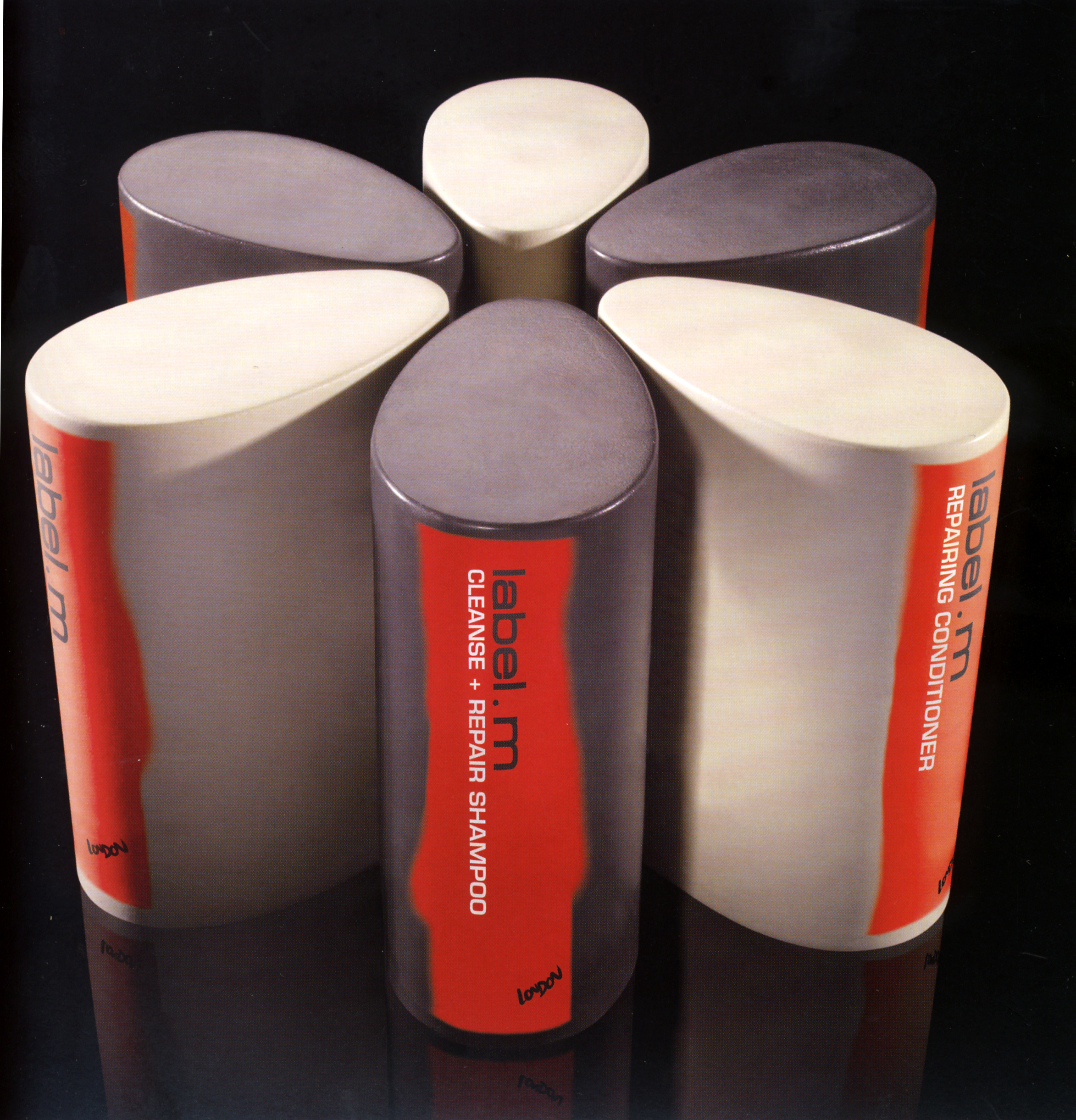
The philosophy: simplicity, performance and quality. Pure Equator's distinctive packaging for Label M uses sharp contrast for impact. The sober colors of the containers contrast with vivid labelling inspired by the spray paint aesthetic of yhe graffitied urban environment.
Reference:
Mark Hampshire, Keith Stephenson, DemoGraphics Packaging, Logos, Modena, 2007

