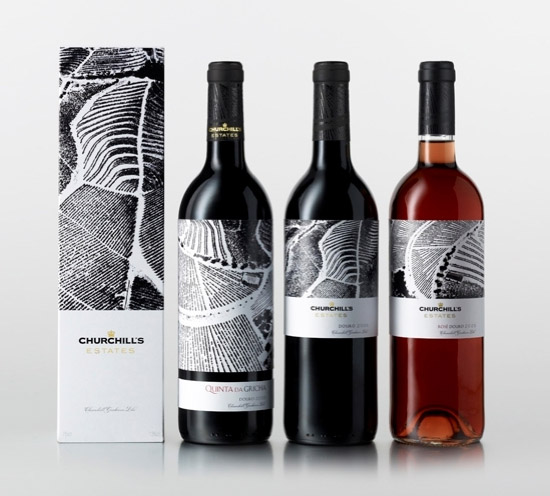
Via Design Week: "Interbrand has refreshed Churchill Wines’ identity and redesigned the packaging across all its port and wine ranges. [..] The new packaging for the Portuguese-based wine group is said to reflect the environment in which it is produced. ‘We went to the Douro Valley, which inspired the photographs and illustrations on the packaging,’ explains Nunzi-Mihranian. She says that these values are represented by the tagline ‘Worth waiting for’, which has been coined by Interbrand. The marque has been adapted across all ranges and the typeface has also been clarified. ‘We brought the crown back, which the company didn’t always use, and, as the typeface is quite iconic, we just tweaked it,’ says Nunzi Mihranian. An embossed logo appears on the bottle in black gloss, printed onto a thick paper stock, to show ‘purity and simplicity’, according to Nunzi Mihranian"
Reference:
http://www.designweek.co.uk/news/interbrand-updates-churchill-wines/1140874.article
