A concept from Hamish Smyth, a student at RMIT (Melbourne, Australia).
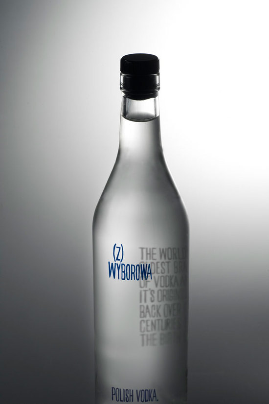
"Label re-design using only typograpy for Polish Vodka brand Wyborowa. My concept uses hand drawn typography - referencing traditional Polish graphic design which featured lots of handmade type.
The clarity of the vodka is its main feature, which is emphasised by having the story of the Vodka’s origin on the back of the bottle. The viewer peers through the product to read the story. When viewed on an angle the viewer gets an interesting warped optical effect whilst isolating the products name on the front of the bottle."
Reference:
http://www.hamishsmyth.com/index.php?/recent/wyborowa-vodka/

