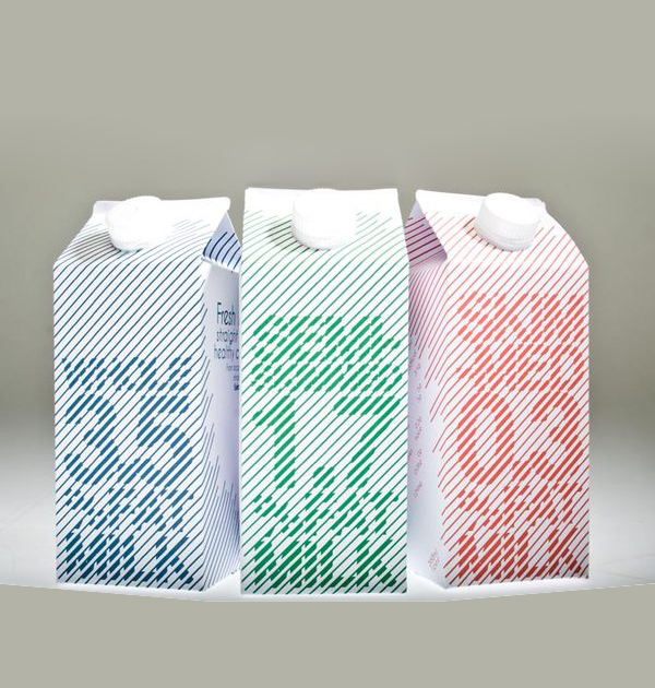
"I wanted to keep it very typographical so I explored legibility with type. I realised that people tend to choose milk by what colour it is and what size it is rather than reading what it is. So I had this knowledge in mind when experimenting how illegible I could push the type."
Reference:
http://www.tomsuthdesign.co.uk/graphic_hand_picked.html

