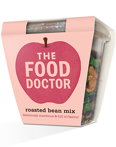
Pearlfisher has created a new brand identity - and redesigned the packaging across the entire range - for the UK's leading nutrition consultancy The Food Doctor. The new identity needed to embrace the ‘Eat better forever' strapline and move the brand focus from a functional product to more of a lifestyle proposition. Pearlfisher Creative Director, Natalie Chung, explains, "We have created a memorable symbol which bonds food & health together in a wholesome, tasty icon - the apple. The apple reflects the brand journey from seed to life and provides an inspirational identity for future celebration and growth to communicate the core truth of The Food Doctor philosophy - that this is a way of life and not a fad, nor a diet."
Natalie continues, "The language throughout is both simple and informative, empowering consumers with the knowledge they need to understand their food and truly love their bodies. The use of colour across the range builds this message by injecting the brand with a sense of continuous energy and positivity."
Reference:
http://www.thefooddoctor.com


