Every month Icon megazine asks designer to rethink and redesign some famous product packagings.
A Practice for Every Day Life chooses Haribo candy with the aim to creating an identity and packaging that isn't just for kids, and that grown-ups might be proud to have on their desk or dashboard.
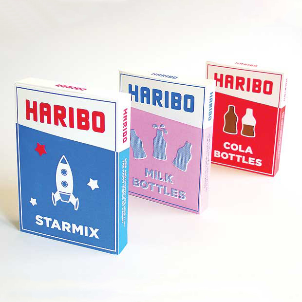
Today crinkly plastic bags that show off the sweets inside may appeal to children, but not to adults so the concept proposes using a cardboard box instead, with a wide opening for easy sharing. Also the current packaging features bright colours, illustrations and gradients and suffers from an unstructured design. Typographically, there is a lack of consistency between products, and different sweets are given random adaptations of the logo.
Simplification keeps the box clean, eye-catching, cost-efficient and collectible. Because there are so many products in the Haribo range, colour plays an important part in customer recognition. Limiting designs to a maximum of three colours avoids confusion; these can then be embellished with patterns and textures. Bright colours keep the identity playful. As the sweet shapes are so instantly recognizable (they have been unchanged since 1922), simplified icons can be used to tell customers what they are buying at a glance, without the need for photography or a clear window.


