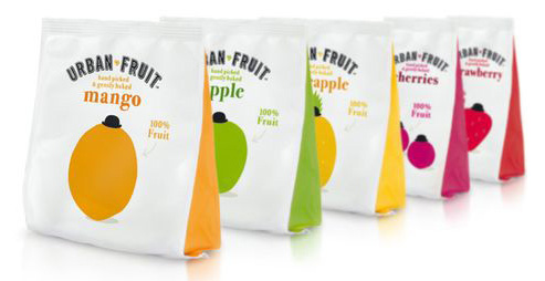
The UK-based dried fruit snacks maker Urban Fruit redesigned its packaging. The brand’s flexible pouches now feature a “fruit-centric” look . Colored gussets call out each variety and bring a splash of color to the design—a technique that maintains a simple front panel to encourage shelf standout.
The more important part of the packaging is obviously the presence of the bowler hat on each fruit. This hat symbolises all the idea of urban and assures the consumer that he will be able to eat those fruit with all the city’s stylishness. But even if there is the presence of an elegant piece of clothing, the hand made-country-side look’s like typography put the consummer in front of an affordable food.

