On the preliminary stage of the project, KIAN brand agency, together with representative of the “Yarmarka” company, worked on shaping and detailing the package of the product. In order to implement a solution for creating brand identity, a bonus image was created, providing minimal design with simple font yet with powerful visual identifiers present.
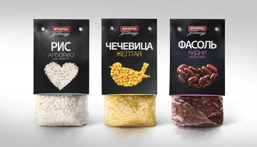
The most important part in package design is the visual image of the product-attractive and absorbing grains in unusual shapes and colors, placed to create the visual of simple and positive graphic symbols. This decision allowed the creation of an effective product navigation system: each product category was given its own graphic image, identifying the category not only visually, but on an emotional level as well. The goal of identifying the different mixes the company sell was solved by using a complex figure, created from petals, of which each one represented an ingredient in the mix.
As a result of the changes implemented, a more modern and attractive image was created, allowing the brand to establish a bold and colorful presence on store shelves, leading to its product standing out from competitors and sales being realized without the investment into new marketing or commercials.


