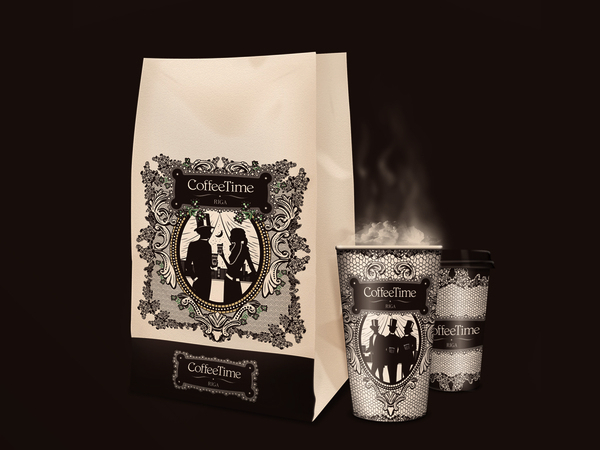
There is a contrast between the images and lettering used, and the packaging method. The images and the characters are elegant and remind of the beginning of the century. The colours (brown, beige and black) fit perfectly with the images, the logo and the product (coffee). On the other hand the packaging is the well known one-use paper cups and paper bag. Still, this “cheap” method is hardly recognizable thanks to the package design.
Reference:
http://studio-43.org , http://www.behance.net/studio43


