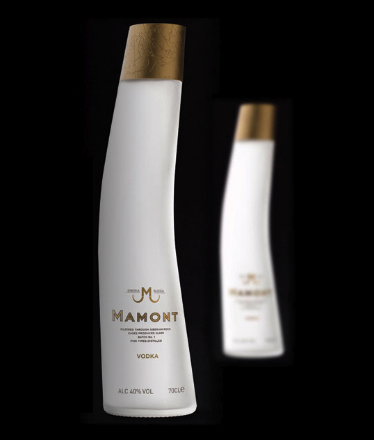
“Mamont” means mammoth in Russian, so that’s why the shape of a bottle reminds you of a tusk. To give it an authentic feel, designers from Stranger & Stranger used a real mammoth tusk to create a mould for the bottle. The white bottle easily connects to both the real colour of a tusk and the snow where mammoth lived. An even deeper feeling of cold comes from the touch of the matt surface, as to remember the user that vodka should be preverbal drank cold. On the top there is beautiful golden cap engraved with a map of Siberia, where the product comes from. Gold paint is also used in the logo and the “Mamont” word printed on front of the bottle. The combination of gold and matt white creates rich feeling of a premium-quality product.
Reference:
http://mamontvodka.com , http://www.strangerandstranger.com/mamont1.html
