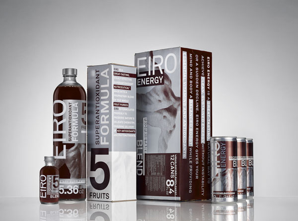
DJ Stout and associate Julie Savasky have designed identity, packaging and collateral materials for Eiro, a new line of health and energy drinks. The beverages are created from exotic fruit purées from South America and are rich in beneficial antioxidants and phytonutrients. The line was unveiled at a splashy launch event in Dallas last month and will be sold online through direct marketing and network sales.
"It was an interesting design challenge," says Stout, "Like many packaging assignments we get involved with a line was established early on and we had to dance back and forth across that line in order to find the final solution. On one side of that line the beverage packaging had to communicate its health and medical benefits and on the other side it had to be distinctively attractive to the target audience."
Stout and his team were influenced by historical medicine bottle designs as well as contemporary medical and health packaging. "Much of the look and feel of medicine bottles and labels over time has developed accidentally and without much thought," says Stout, "There are a lot of big numbers and lots of type on those packages. We took that as our main inspiration."
The Eiro graphics are influenced by historical and contemporary medicine and health packaging.
Pentagram helped with naming. Eiro comes from the Portuguese word inteiro, meaning whole.
Eiro's natural energy drink provides a boost without a sudden decline.
The contemporary look of the Eiro family of products is unique in its category, which tends to be stodgy and conservative.
Reference:
http://pentagram.com/en/new/2009/04/new-work-eiro.php#more


