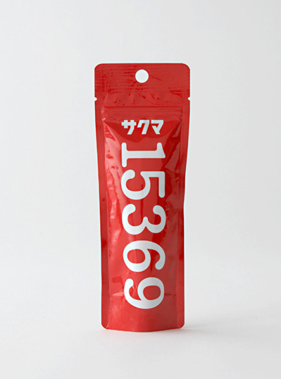
From Japanese-based design firm Taku Satoh, comes this super simple packaging for Sakuma Confectionary Co. What is actually in the thin, tube-like packages is a bit of a mystery, made more intriguing by the puzzle around the significance of the numbers branded across the front. Of course, there are theories: fruit drops flavored like strawberry milk are the presumed contents, which the numbers are said to signify. As the hypothesis goes, when spoken in Japanese, 1-5-3-6-9 sounds like ichigo miruku, which means — that’s right — strawberry milk. Whatever its true meaning, Sakuma Confectionary Co.’s simple, intriguing packaging is a cool piece of work that can be appreciated for its design alone.
Reference:
http://www.tsdo.jp

