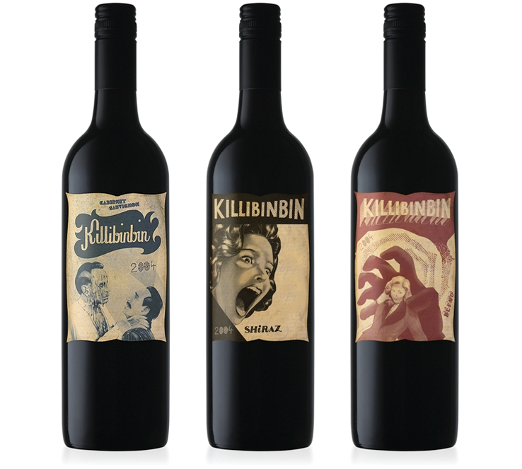
The main US distributor of Killibinbin wines was always commenting on these wines as being 'Killer'. A tongue and cheek approach and a play on words lead to the final idea, taking this 'Killer' comment as the theme for re-packaging the Killibinbin wines. Illustrations were developed, taking from old horror flicks and their gruesome killing scenes. All text was hand written on front labels and the print finish is on a bulky uncoated stock to give the feeling of an old horror movie flyer.
The Killibinbin range of picture wines received a Gold Graphis Award in 2007 (based in New York).
Reference:
http://www.mashdesign.com.au/projects_html/killibinbin.html


