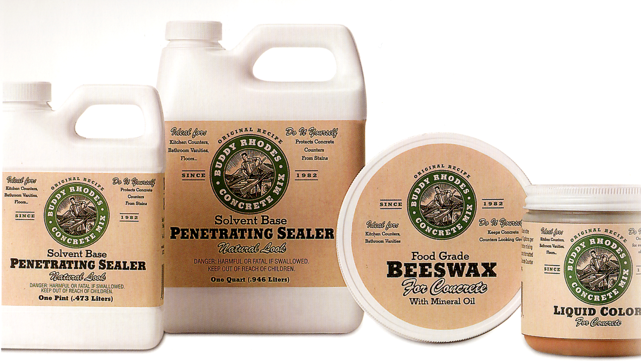
Buddy has a reputation, but no packaging, so the design team felt it was necessary to build a brand around his name. The overall presentation is that of a respected, serious industrial product presented in a novel way. For the logo and branding treatments, the team introduced a central "character". While not intended as a portrait, Buddy Rhodes immediately felt an affinity for the coarse, wood-cut image of a toiling character that would become the emblem of the brand. Body type reinforces the sturdiness of the product, conveying both "retro" and "designer" aspirations. The graphics were designed to be easily reproducibile and look good using the lowest quality flexo printing on low-grade kraft paper. The "distressed" look of the printing was intentional, and the imperfections make it look like part of the system, especially on the brown paper sack. Customer feedback has been very positive and brand and product sales have grown significantly.
Reference:
Mark Hampshire, Keith Stephenson, DemoGraphics Packaging, Logos, Modena, 2007


