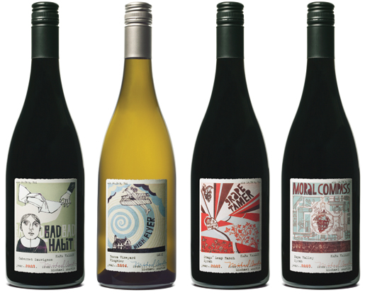
Michael Austin Wines: "Each wine label recounts a story loosely inspired by anectodes of the two founders' lives...very loosely, that is" Gaby Brink, Creative Director of Temple Brink The Michael Austin Winery was started in California by two long-time friends. The person Michael Austin does not actually exist - Michael and Austin are the middle names of the two founders. Approached to create the branding and packaging for the winery, design consultancy Temple Brink turned this fact into a unique angle that would help enrich every every aspect of the brand's communication, inventing a fictitious character and creating stories about him to give personality and humour to each of the wines. The stories are based on real anectodes from the founders'lives. Bad habit efers to how the two met as young men in a Catholic high school; HIgh Flyer relates to the fact that one of them flies small airplanes as a hobby. Complicit in this playful fiction, the savy customer is entertained by these far-fetched tales. Thus, we are led to believe: "Michael Austin grew up in a monastery on the outskirts of France. He was raised by a pack of wild nuns who taught him how to live on a strict diet of wine, cheese, and real estate investments. Today, he is religious about only one thing - making great wine". Humorous illustrations adorn the labels in a palette of deliciously muted tones. In a sector that often relies on quirky names and punchy copy to create distinctiveness, this packaging achieves the perfect balance of humor and sophistication - leading AIGA jurors to commend the design's whimscial naming and provocative style, commenting: "Everything about it has that handcrafted quality, personal touch. It feels like they made that batch just for you".
Reference:
Mark Hampshire, Keith Stephenson, DemoGraphics Packaging, Logos, Modena, 2007


