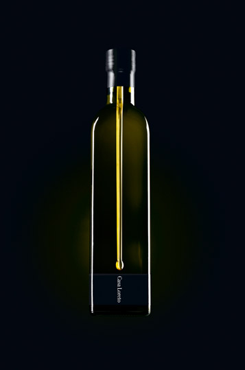
Casa Loreto is a luxury Tuscan olive oil of exceptional quality, regarded in its home region as "oro liquido" - which translated to English as "liquid gold". The brand is intended for the international market, currently experiencing a huge increase in sales of super-premium single estate olive oils among sophisticated adults. Design consultancy, The Partners was challenged to package Casa loreto in a way that would express the precoiusness of the product while creating standout within a highly saturated marketplace. Taking a lead from the oil's locator epithet, the design evokes a single drop of the liquid gold escaping down the bottle toward the label, ingeniously executed in three dimensions. The pared down bottle design heroes the liquid drop, with typography kept to a minimum. All the information is expressed in Italian, emphasizing the authenticity of th eproduct. The packaging has won several awards, including D&AD '06 Silver for Packaging and New York Festivals '06 Finalist for Packaging. Testament to th design's originality, client, Jean fraser-Cami enthused: "The bottle superbly expresses the desirability and quality of our oil. It certainly seems to make people very curious to taste it"
Reference:
Mark Hampshire, Keith Stephenson, DemoGraphics Packaging, Logos, Modena, 2007
